CSS – 画像の上に文字を重ねその上にリンクを重ねる
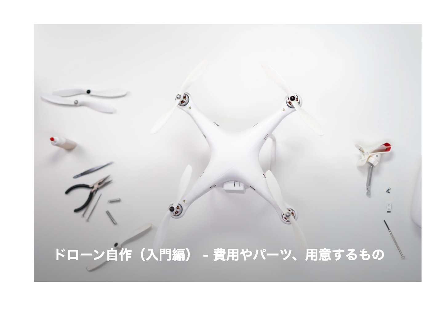
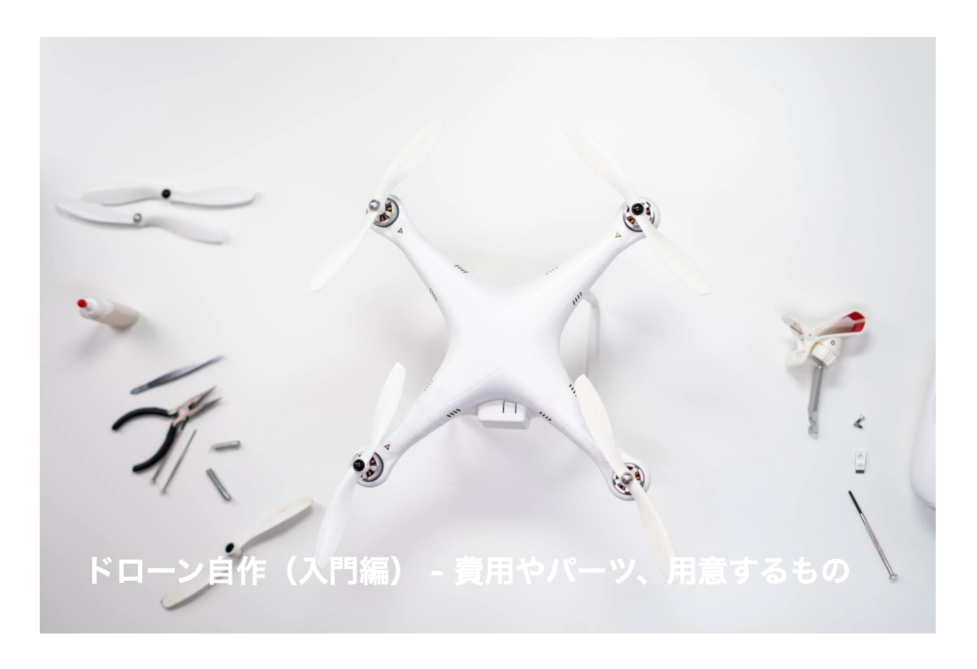
下の画像のようにWeb上でよく見かけるエフェクトの作り方をご紹介します。簡単な作りとなっていますのでご理解ください。
サンプルコード
<!DOCTYPE html>
<html lang="ja">
<head>
	<meta charset="UTF-8">
	<meta http-equiv="X-UA-Compatible" content="IE=edge">
	<meta name="viewport" content="width=device-width, initial-scale=1.0">
	<title>Document</title>
	<style>
		.wrap_box{
			max-width:700px;
			margin:auto;
			position:relative;
			background:#111;
		}
		.wrap_box img{
			width:100%;
			height:100%;
			vertical-align:top;
		}
		.wrap_box h2{
			position:absolute;
			bottom:10px;
			left:0;
			z-index:80;
			color:white;
			padding:0 35px;
		}
		.wrap_box a:before{
			content:"";
			position:absolute;
			width:100%;
			height:100%;
			bottom:0;
			left:0;
			background: linear-gradient(rgba(0, 0, 0, 0) 50%, rgba(100, 100, 100, .5) 100%);
			transition:.5s;
			z-index:70;
		}
		.wrap_box a:after{
			content:"";
			position:absolute;
			width:100%;
			height:100%;
			bottom:0;
			left:0;
			z-index:100;
		}
		.wrap_box a:hover{
			background: linear-gradient(rgba(0, 0, 0, 0) 50%, rgba(100, 100, 100, .9) 100%);
		}
	</style>
</head>
<body>
	<div class="wrap_box">
		<h2>ドローン自作(入門編) - 費用やパーツ、用意するもの</h2>
		<img src="https://images.pexels.com/photos/3945674/pexels-photo-3945674.jpeg?auto=compress&cs=tinysrgb&dpr=2&h=750&w=1260" alt="">
		<a href="#"></a>
	</div>
</body>
</html>
解説
HTMLについて
では、骨組みのHTMLから説明していきます。画像全面をクリックしたらリンク先に飛ばす構造にしたいので、下記のようなHTML構造にしています。<a>タグを<div class="wrap_box">~</div>の上に被せる構造にしたいためです。
<div class="wrap_box">
	<h2>ドローン自作(入門編) - 費用やパーツ、用意するもの</h2>
	<img src="https://images.pexels.com/photos/3945674/pexels-photo-3945674.jpeg?auto=compress&cs=tinysrgb&dpr=2&h=750&w=1260" alt="">
	<a href="#"></a>
</div>タイトル(<h2><a href="#"></a></h2>)内や画像に要素をつなげてしまうとCSSの実装が大変なので<a>タグを独立させてます。
CSSについて
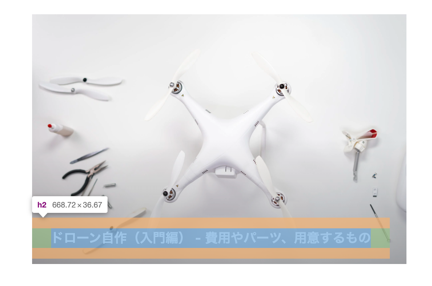
まず、position設定をして画像と文字を重ねます。.wrap_boxを親要素、<h2>タグを子要素と設定。画像にvertical-align:top;とありますが、これは画像下の余白を消すためです。
<style>
	.wrap_box{
		max-width:700px;
		margin:auto;
		position:relative;
		background:#111;
	}
	.wrap_box img{
		width:100%;
		height:100%;
		vertical-align:top;
	}
	.wrap_box h2{
		position:absolute;
		bottom:10px;
		left:0;
		z-index:80;
		color:white;
		padding:0 35px;
	}
</style>
画像の上に文字を重ねてその上にリンクを重ねたいのですが、画像の色によっては文字の色が見づらい時があります。今回のサンプルだと画像が白で文字色が白です。これ場合だと見づらいです。
どんな画像色がアップロードされてもテキストが見やすいようにbackground: linear-gradientを使用して文字の後ろの背景を黒くします。ただ、黒くしてしまうと画像そのものが見えなくなってしまうので、グラデーション設定で透過させて画像も見えるようにします。
ただ<a>タグにそのようなCSS指定しても下記の画像のようにテキスト範囲だけがリンクがない状態になります。
これだと不恰好なので:before , :afterを使用し「:beforeを文字の後ろの背景色」「:afterを画像全面のリンク」と指定。さらに、z-indexで階層を調整することでテキストの背景が黒くなり、テキストの上はリンクで覆われているエフェクトができます。
<style>
	.wrap_box h2{
		position:absolute;
		bottom:10px;
		left:0;
		color:white;
		padding:0 35px;
		z-index:80;
	}
	.wrap_box a:before{
		content:"";
		position:absolute;
		width:100%;
		height:100%;
		bottom:0;
		left:0;
		background: linear-gradient(rgba(0, 0, 0, 0) 50%, rgba(100, 100, 100, .5) 100%);
		z-index:70;
	}
	.wrap_box a:after{
		content:"";
		position:absolute;
		width:100%;
		height:100%;
		bottom:0;
		left:0;
		z-index:100;
	}
</style>